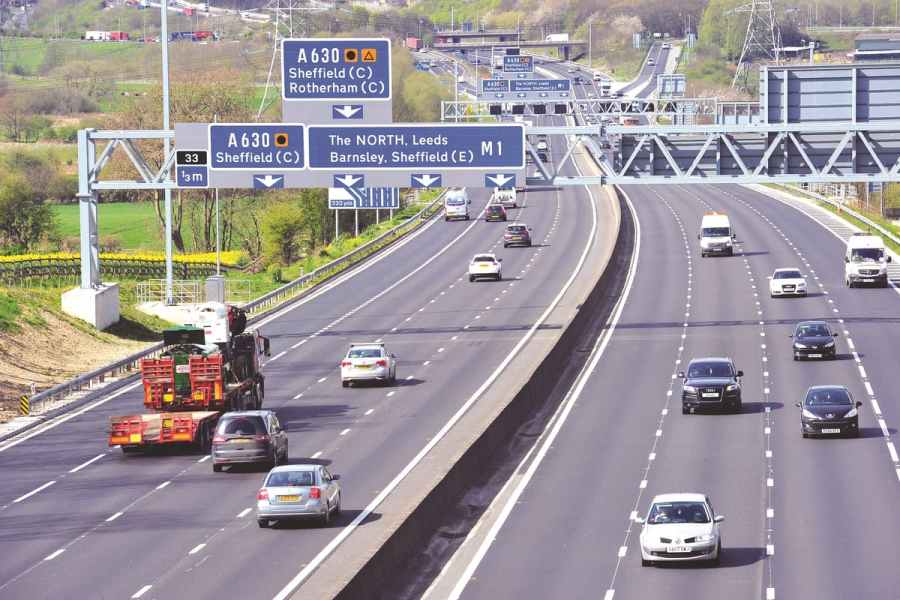
A FEW DAYS ago my wife and I had occasion to travel from our home in North Lincolnshire to Sheffield, a journey of just more than an hour.
It was one which included the M180, M18 and M1 motorways, and typically for a weekday, we shared these roads with a great many heavy goods vehicles (HGVs).
Of these HGVs, a significant percentage (of an ever-increasing number) were emblasoned with bewildering, brain-bending signage.
You’ve seen them:
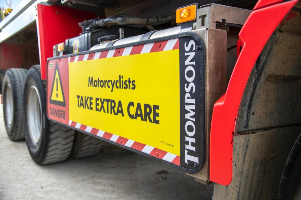
‘TAKE EXTRA CARE NEAR THIS VEHICLE.’
‘WARNING: THIS VEHICLE MAY TURN LEFT OR RIGHT.’
‘CAUTION: THIS VEHICLE IS LARGE.’
Well, thank goodness. If there’s one thing we needed, it was even more cautionary reminders of the downright obvious.
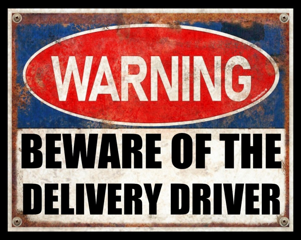
So, let’s talk briefly about lorry safety signs — those polite but utterly baffling messages appearing more and more on the back, sides and, indeed, the backsides of commercial vehicles.

Supposedly designed to keep us safe, they often leave us squinting, shrugging, and wondering if we’ve strayed into ‘Health and Safety La-La Land.’
Take Extra Care… As Opposed to What?
One such sign, for example:
Here’s the thing: ‘Take care‘ is reasonable (though unnecessary) advice. ‘Take extra care,’ though – what does that mean exactly? Surely care is … well, care.
There’s careful and there’s careless. Care is not a ranked commodity – it’s either there or it’s not.
Besides, if I’m near a lorry which is travelling at speed, any speed — I’m already taking care, believe me. I don’t need bold, primary-coloured signage to remind me that capering around 20 tonnes of fast and furious juggernaut is liable to end badly.
But hey, thanks anyway.
Size IS Sort of Important
THESE SIGNS are sometimes little larger than Post-it note size, and when slapped onto a very large metal object travelling at umpteen MPH their very existence raises questions.
Some may be crammed with barely-legible text and alongside baffling diagrams that are as confuddling as IKEA assembly instructions.
Besides which, if another road user needs to decipher a paragraph of health and safety jargon while simultaneously navigating traffic, potholes, and the possibility of being crushed, something’s gone wrong. Surely.
Useful vs. Useless
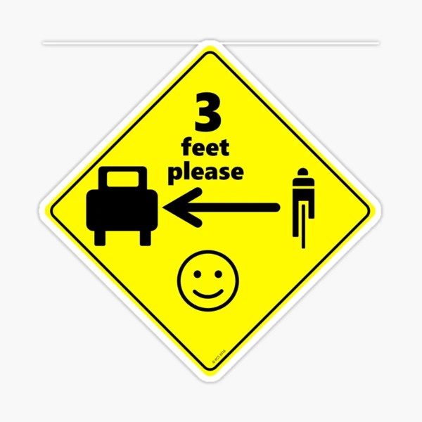
Now, there are some good signs. ‘Cyclists: Stay back‘ — short, sharp, clear. (Should such cautionary notice be required, that is.)
I have the view that if road users need such prompts, advice and reminders, they perhaps ought not to be road users at all.
But then some signage just seem like legal disclaimers written by lawyers having midlife crises.
Some even say words to the effect: ‘Driver may not see you.‘ Now that’s encouraging. The last thing you want to learn when staring down 18 wheels of potential blunt trauma is that the driver is possibly blind to your existence.

So Who Are These Signs Actually For?
Not me, I suspect.
Many of these warnings are less about actual safety and more about covering backsides. It’s a bit like saying, ‘We warned you!’ in small print, on a rapidly-moving object, while you’re busy trying to avoid death.
There is an upside: if you do get flattened, at least the insurance company has photographic evidence that the sticker was there. You were warned, after all. So that’s one box ticked.
Are They Actually Dangerous?
Weirdly … yes. In the same way that too many fire exit signs in a building just turn into wallpaper, and too many Hi-Viz jackets in a Hi-Viz environment are no less than Hi-Viz camouflage.
Too many monotonous warnings mean we stop noticing any of them. We become sign-blind. And then what?
Plus, when cyclists or pedestrians are distracted by having to read badly-sited health and safety caveats mid-traffic, that’s not exactly an ideal situation.
There Is a Better Way
What would help?
- Signs that are clear, bold, and brief. Think: ‘Stay back. Blind spot.’ Job done.
- Standardised designs. So we don’t have to be multi-lingual to understand what we’re being alerted to.
- Fewer signs, better placed. Quality over quantity.
- Lorry design that actually makes them safer. You know, mirrors, sensors, actual visibility.
Final Thoughts from the Road
Don’t get me wrong — I’d rather be mildly annoyed by a useless sign than be flattened by a truck that didn’t see me. But if we’re going to plaster vehicles with warnings, let’s make them readable, and worth reading.
Or, at the very least, funny.